


Potfest in the Park 2024
- thora50
- Jul 29, 2024
- 6 min read
It was a rainey morning in July when I arrived at Potfest in the Park. The first person we saw was Ben Fosker. It was really nice to see his work. I knew of him, but hadn't actually looked at his work in depth.
Now I am making platters of my own using, amongst other clays, thick grogged earthenware with torn edges sometimes. I found he also had untidy edged wares, looking good with an animal decoration on it.

When I asked him what inspired him and was his ethos, he said it was about his subconcious, what idea he wakes up with. The animals are a way of portraying himself. I think this is true of a lot of ceramic artists work.
He also said it takes time to develop a free style.
I particulary liked his ethos behind a platter of a hare. I asked what then was his ethos behind this platter... it was of a hare looking backwards...he said the hare was looking behind him. I got his point.


Although I am not working in the sculptural, I am enjoying the freedom and variety of Ben's work.
Heather Elvidge
I liked Heather's work, the design was beautiful, and intricate. In the plates were beautiful scenes of the countryside. She uses the more usual sgraffito positive method of removing the darker clay surroundings, leaving the positive image dark...you can see that a lot of skill and time has gone into these.
I said that I was developing sgraffito in my work. I said that I was looking at man's negative impact with animals and said I really wanted to portray the beauty of the animal. She said that the beauty of the animal makes people want to protect the environment - you dont want to make people feel sad with the pots.

Simon Olley
He is inspired by the Kent countryside and walks with his black labrador, Uly. As well as inspiration from his own life Simon makes commissions featuring other people's animals. He is traditional positive sgraffito. I remarked that I had been finding, as I continue to do more sgraffito especially with my new sgraffito tools, that the use of pattern comes into the work, and gives the work a folk art style. He agreed.


Jon Barrett - Danes
Jon's work is inspired by animals, he keeps sheep and hens at home as well as cats and dogs I think. Pottery has been in his family for generations and he is a keen observer of nature. He also says that the animals reflect himself.
The sculptures were fun and some rather large!
He does have a range of smaller ware.


He uses a winch system to load his kilns. The sculptures have interesting texture, but the colours used are fairly simple.
Felicity Lloyd Coombes
Felicity is inspired by animals and has been interested in pottery and sculpture from an early age. She enjoys doing commissions and her work is very 'true to life' unlike some of the other animal sculptors I saw at Potfest.


Another animal sculpture I liked

Chiu - Wu Ceramics
Chiu - I was a lovely person to talk to and gave me a lot of her time and encouraging information. She said she started as a 2- D painter then after trying ceramics finds she works mainly in ceramics now. I'm the other way round, art for me has always been in ceramics, its just that quite a lot of my previous work was painterly. I am now becoming interested in 2D as well, and have touched on it in the printing.
Chiu - I 's work is enchanting, she works with childhood memories and daydreams. She is very skilled technically and 'pinches' a lot of her work, I'm not sure if this means coiling too. Her work is very unique and beautiful.

They look a bit fierce, like Rob's dogs, with lots of teeth!
Rob Parr
Rob is my tutor at Uclan, and has given us insights into his career and his life.
I hadnt really asked him before about his work. It is a bit querky, but the not overcomplicated design and the bird sculptures, with a matt finish are very pleasing. The birds being black introducing a slightly menacing feel, but at the same time realistic and exquisitely sculptured.
I inquired about the bowls with the birds.....its a long process to make them, and maybe I will acquire one someday.
The pastel colours of these stands look well with the black birds.


The owls are lovely too. Rob said he is portraying (human) interaction by his sculptures, I can see the individual pieces working together now. My friend John commented on these after visiting Rob's pitch.
I was kindly given the recipie for the engobe Rob uses for these sculptures... I decorated Little Black's box like this.

Jaeeun Kim
This is lovely work. I particularly like the lone cat or dog. She said they were finding their way back home, which evokes a whole lot of emotions and truths.
I like the colours too, and the black silhouette of the animal. The silhouettes are small, a small apparently insignificant animal finding its way in the large world, with its good sense of direction.


Jeremy James
These sculptures portray the horse very well. I love their expressive eyes and head features especially. I did talk to the artist, who said they symbolised enjoying the ride ( in life ).


Karen Wilkinson
Karen was my first pottery teacher at Kendal College, back in 1986. Without her encouragement, my life would have taken a different path in respect to my ceramics.
I have always admired Karen's work, the large coiled pots are precisely symmetrical, no easy task. They are then burnished and wood smoked. I did a little of wood smoking with Karen.
I bought one of her beautiful, smaller pots..

Jaroslav Hrustalenko
Jaroslav is from Ukraine. His teapots and mugs were expertly crafted, and very unique. Apparently the Eastern Europeans do like their forms with a bit of a slant. I thought this was very clever. He told me that the teapots were made in many different parts put together, some thrown, some slabbed.
I bought this mug, which handles beautifully.


Jacqui Atkin
Jacqui was on the Great Pottery Throwdown as a demonstater/judge. Her work is very attractive and I think she uses stencils and coloured slip, possibly with oxides or inlay. I have read one of her articles in Ceramic Review - I will look it up again!
She kindly said she would pose for a photo.


She puts large colourful flowers in her vases, like I do at Potfest. ( I used to work for M&S and they kindly donated flowers for my stall each year.)

You can see what I mean! This is from a newspaper photo at the last Potfest I showed at. One couple bought a large vessel (with horses on ) and asked if they could also take the trailing flowers in it . They didn't want it packed as they said it would ride home in someone's lap in their open topped sports car...picture it!
These had a Scandinavian feel to them. Both in the pastel shades, simple design and functionality. My first essay was on Scandinavian ceramics.


These were by Jo Walker. The designs are clean, and geometrical, like some Scandinavian design. Also the colours.
Ruth King
Ruth demonstrated at the Potter's Camp at Uclan last summer, run by the Northern Potters. I was there..
I like the metallic shiny glazes, which she mixes herself. She says that mixing your own glazes and learning to tweek them, gives much better results than ready made bought glazes. I generally have mixed my own glazes, right from the start, though work to someone else's recipie.

Michaela Schoop
Michaela was exhibiting her meticulously painted and very detailed work. I first met Michaela when she too was demonstrating at the Potter's Camp last year.
A lot of work goes into these with a variety of clays, glazes and decoration patterns. There is also a lot beneath the surface. I think Michaela's research and information behind the meaning of her work is very extensive, I haven't known such a network of communication in work before. Her topics are multiculturalism and comment on the rise of populism.
I liked this orange coloured bowl. Her earrings are also very colourful and detailed.


Di Luka Ceramics
This was an Italian potter, who used smoke firing, raku and used saggars, which he kindly explained to me what they were. Lovely shapes and colours.
He said the sculptural piece was meant to convey balance or lack of balance.
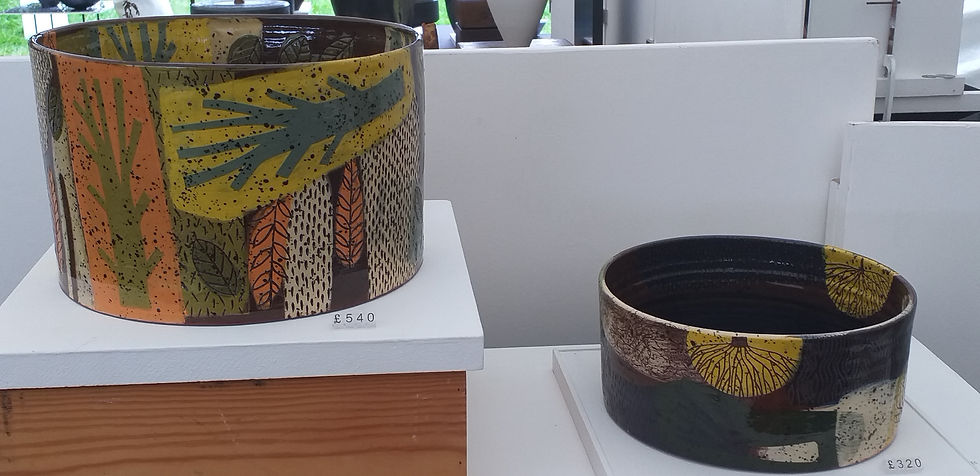
These are some other examples of work I liked.

The above definately feels folky. Clever use of functional with decorative embellishments.
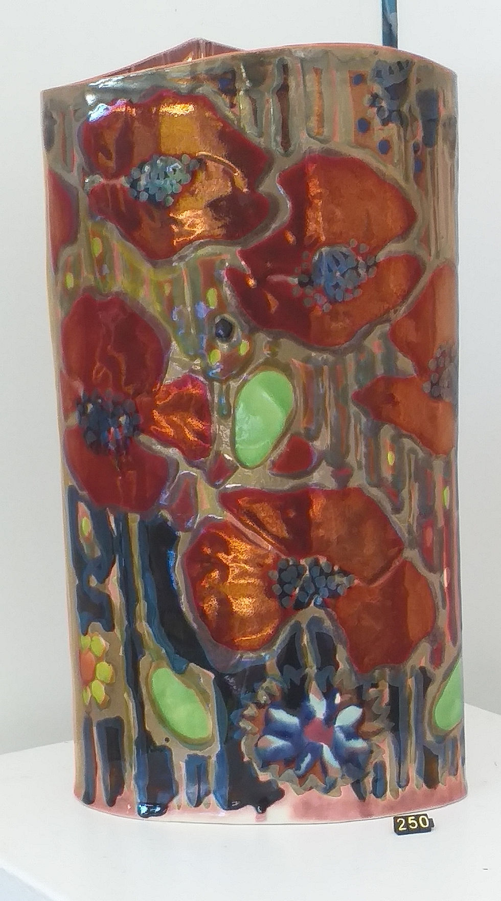
This above, was detailed work using sgraffito again.


The above is the work of Jonathan Cox. It uses tubelining and lustre. Moorcroft was the traditional tubelined work. I visited their factory in the 90's when studying blue and white ware for an Access B essay at Kendal College.
Some examples of lovely English Slipware.


Sliptrailing was the most prominent decoration of these plates and jugs. This is something I have touched on briefly in my last Lynx monoprinting slabs I made at home. Perhaps I should explore this a bit more fully.
Finally the Potfest Competion. The Brief was 'Hybrid'.
I have included the pieces that I liked best. My favorite was the Horse in a beautiful glaze.


This reminds me of Paul Scott's print work, with the industrial landscapes. Suitably adorned with rain drops.


Clever play on words.


Comments